Forum Issues
-
I use the dark "Cyborg" color scheme.
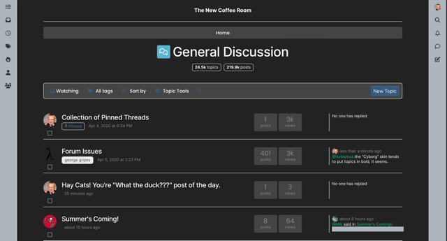
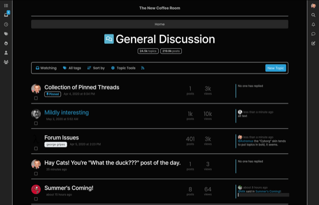
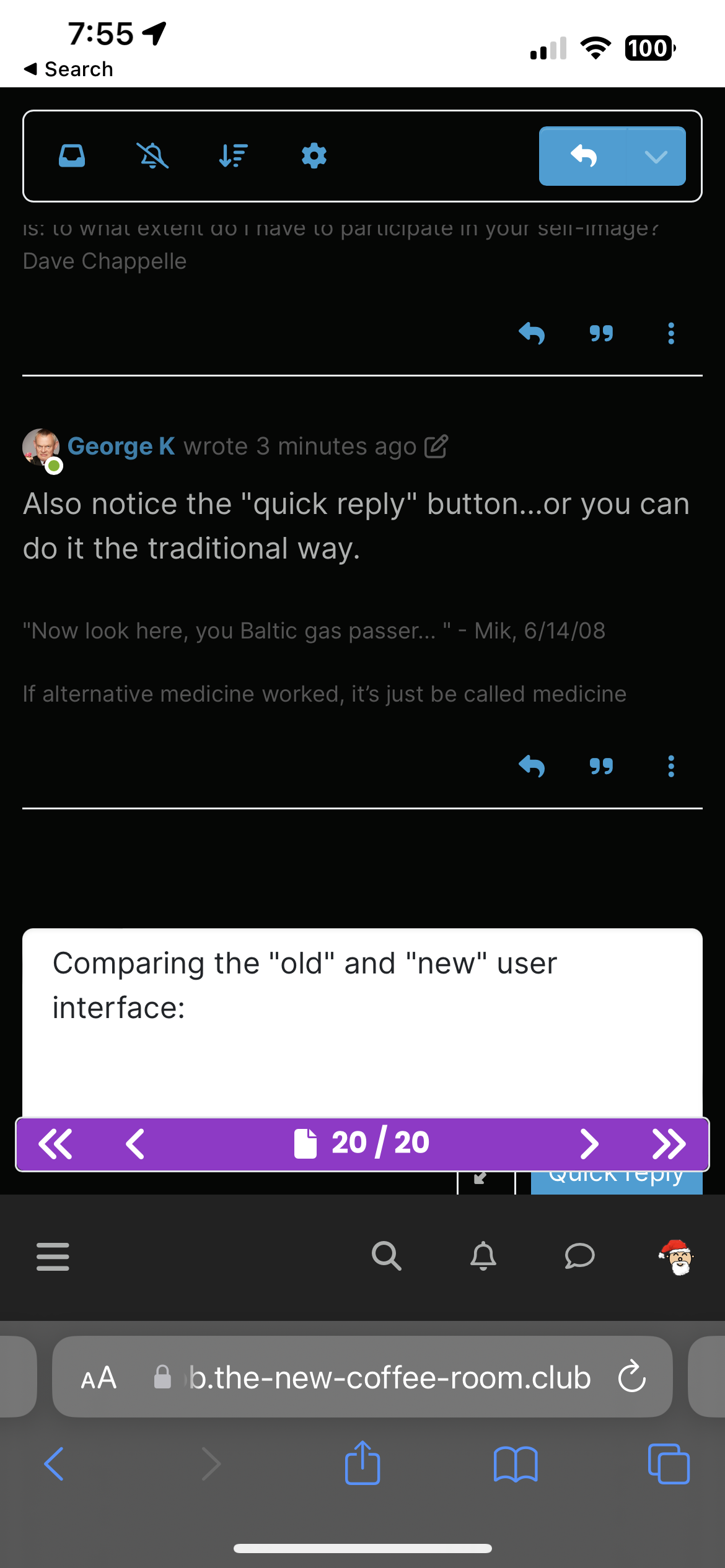
Comparing the "old" and "new" user interface on an iPhone 13 Pro:
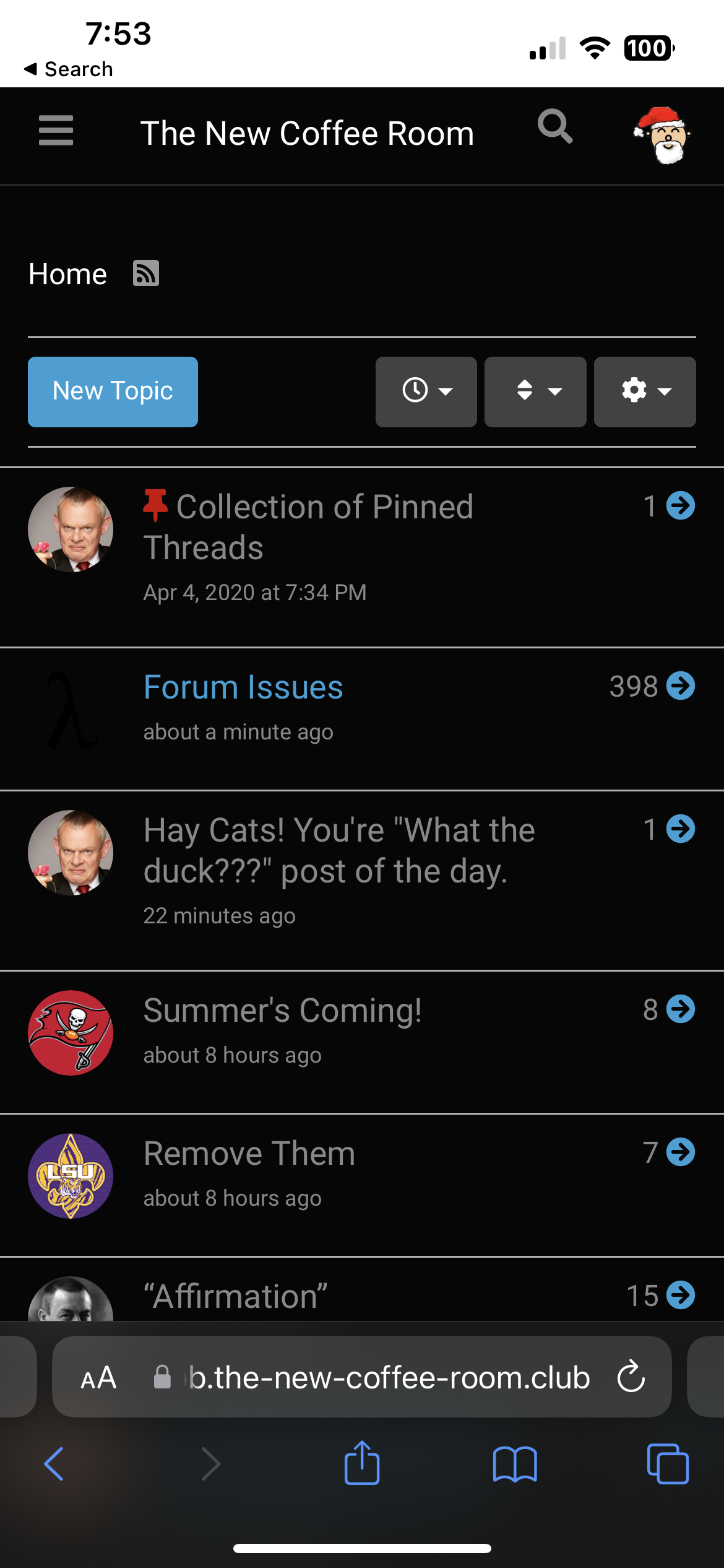
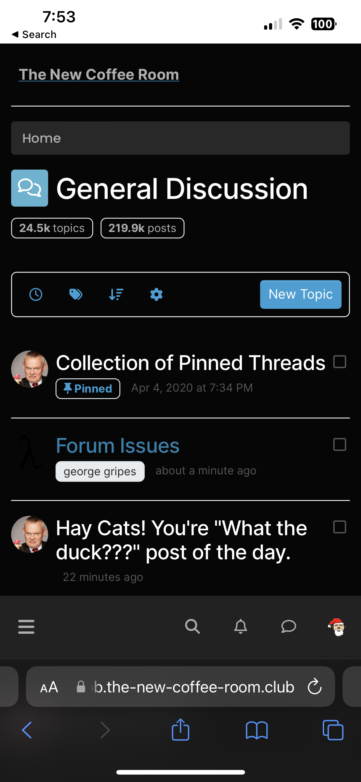
The new interface shows less information (e.g., fewer topics per screen, no view count or reply count information). But probably not a bad thing for aging eyes (and we are all aging).
Also, the "quick reply" box at the bottom is unusable because the page control blocks the "Quick Reply" button -- you cannot tap that button.
Not saying we need to revert to the old version, not leaving a historical record of how things used to be.
Carry on!
-
I use the dark "Cyborg" color scheme.
Comparing the "old" and "new" user interface on an iPhone 13 Pro:


The new interface shows less information (e.g., fewer topics per screen, no view count or reply count information). But probably not a bad thing for aging eyes (and we are all aging).
Also, the "quick reply" box at the bottom is unusable because the page control blocks the "Quick Reply" button -- you cannot tap that button.

Not saying we need to revert to the old version, not leaving a historical record of how things used to be.
Carry on!
-
It all seems fine to me. I have to remember to use the icons at the side of the screen, but I'll get the hang of that eventually. I think the overall look is an improvement, kind of in line with what I'm seeing at work with Outlook and what-have-you.
-
And you have to refresh/reload your browser window/tab to get the new interface ...
I have two Safari window/tabs opened to TNCR, one showing the old interface (and as far as I can tell, the controls still work and I can navigate with them just fine), one showing the new interface. You get the new interface after you refresh or reload your browser.
I will try to not reload/refresh my old TNCR window just to see how long I can keep using that old interface.

-
The mobile version’s search function is MUCH improved.
-
Quoted text is in a larger font - that's a good thing.
Toolbars are on the right and left of the main screen. Not sure about that.
-
OK, so it turns out our old theme is still available in the new NodeBB version. It's just no longer the "default" theme.
I assume you guys like this version better?
-
@Klaus said in Forum Issues:
OK, so it turns out our old theme is still available in the new NodeBB version. It's just no longer the "default" theme.
I assume you guys like this version better?
Yes sir.
-
@Horace said in Forum Issues:
I assume you guys like this version better?
Yes sir.
Which version is meant by "this"?
I like the old one.
@Copper said in Forum Issues:
@Horace said in Forum Issues:
I assume you guys like this version better?
Yes sir.
Which version is meant by "this"?
I like the old one.
This morning the interface was very different, now it's very similar to what we had, though still clearly a new version.
-
@Copper said in Forum Issues:
@Horace said in Forum Issues:
I assume you guys like this version better?
Yes sir.
Which version is meant by "this"?
I like the old one.
This morning the interface was very different, now it's very similar to what we had, though still clearly a new version.
