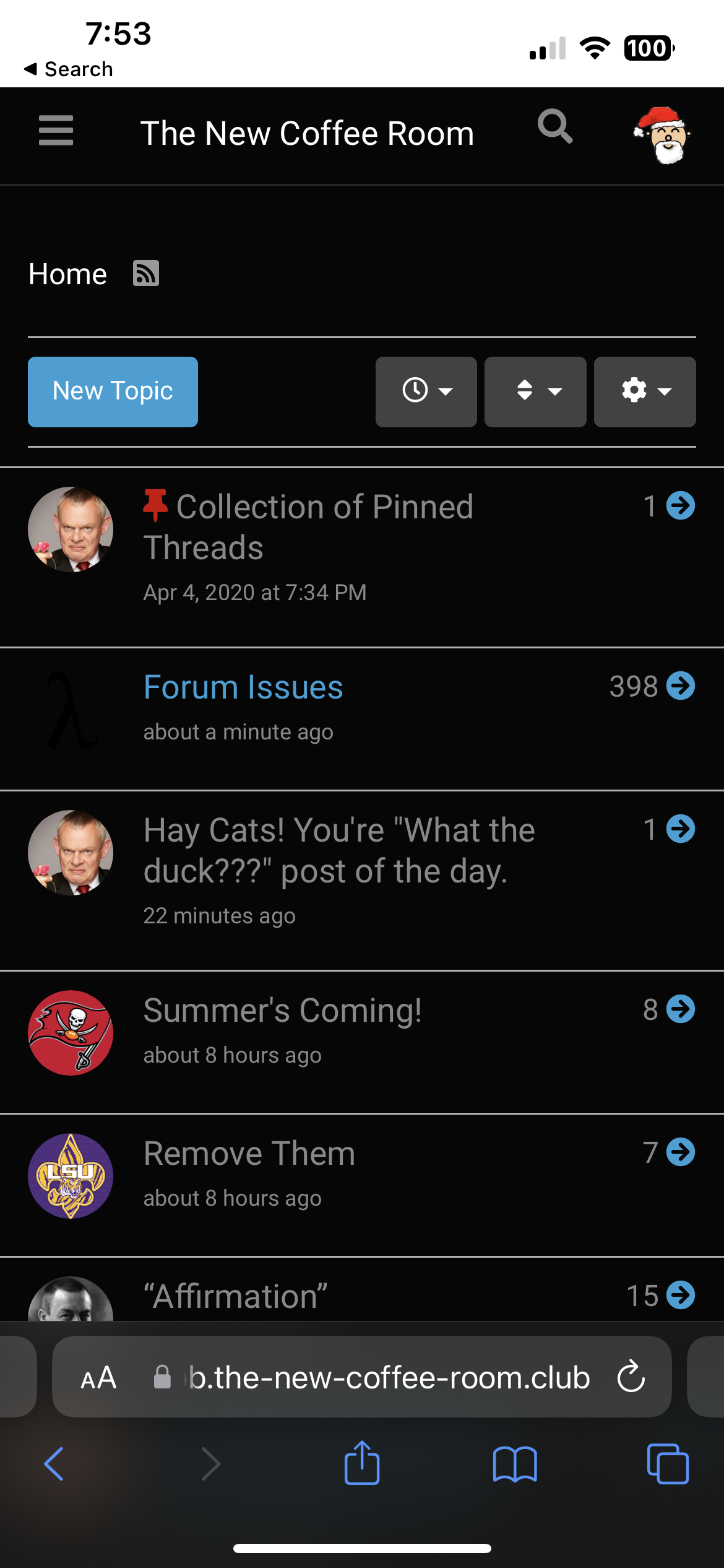
Forum Issues
-
There's a new major version of NodeBB, which includes a couple of changes to the surface that will be visible.
I'm not quite sure how well that new version fits to our requirements and whether the plugins we use are compatible with it.
I'll give it a try. Thanks to backups, I can revert to the old version. But we can't stay on the old version indefinitely because there will be no security updates.
If you have any comments or stumble upon any issues please let me know.
-
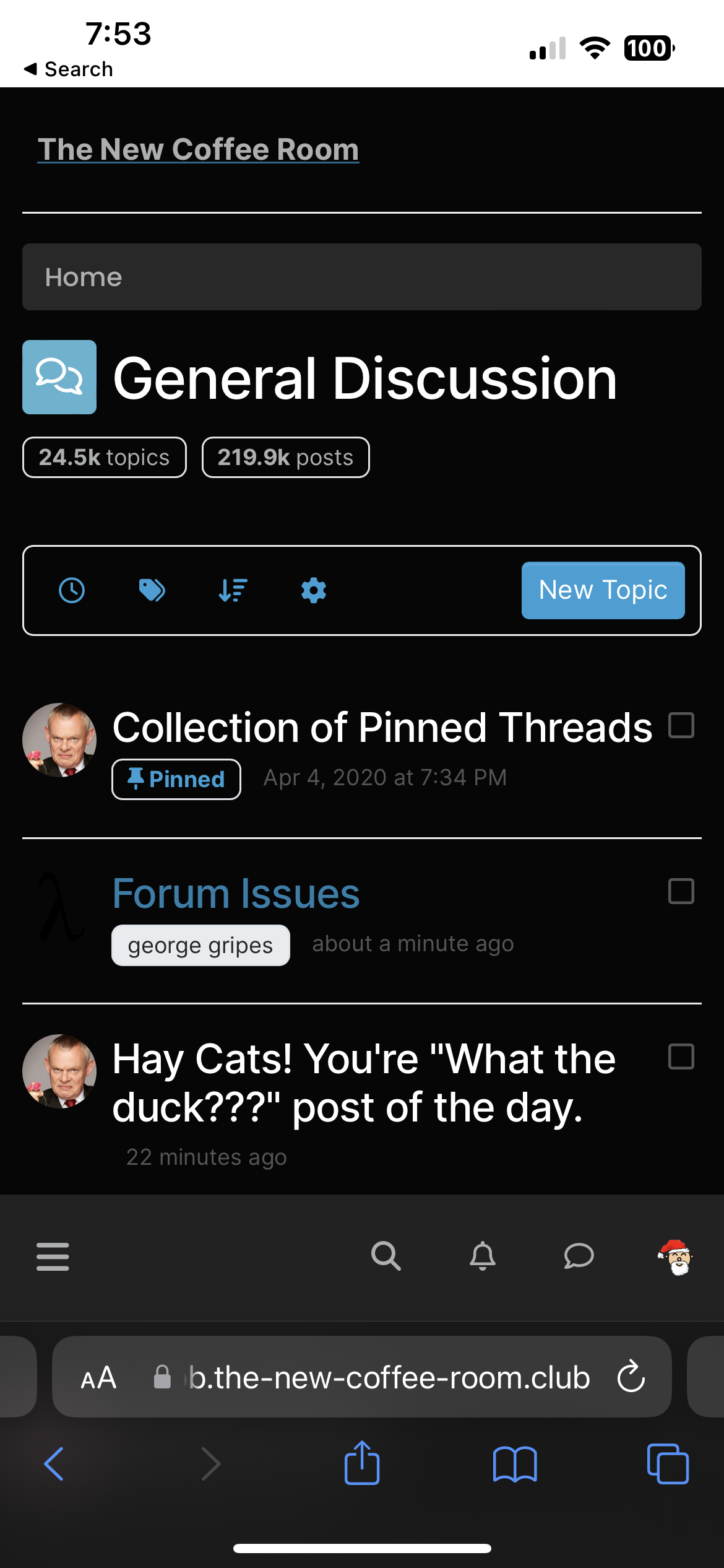
An obvious change is the optical look. The NodeBB developers encourage usage of their new "Harmony" theme. From what I understand, it's supposed to be the new default for NodeBB forums, and also the one with the best support, the most robust one, likely to work equally well on mobile devices etc.
I suggest we should give it a try before concluding that it sucks and we want back to what we had before

-
I’ve noticed that all my posts now appear to be complete bollocks. Is there a plug-in to fix that?
-
Quoted text is in a larger font - that's a good thing.
Toolbars are on the right and left of the main screen. Not sure about that.
"Now look here, you Baltic gas passer... " - Mik, 6/14/08
The saying, "Lite is just one damn thing after another," is a gross understatement. The damn things overlap.
-
An obvious change is the optical look. The NodeBB developers encourage usage of their new "Harmony" theme. From what I understand, it's supposed to be the new default for NodeBB forums, and also the one with the best support, the most robust one, likely to work equally well on mobile devices etc.
I suggest we should give it a try before concluding that it sucks and we want back to what we had before
@Klaus said in Forum Issues:
I suggest we should give it a try before concluding that it sucks and we want back to what we had before
It's almost like you have experience with users and change management. Admittedly when I'm on the user end, I often say "this sucks, give me back what we had" but I also know any UI change becomes quite normal a few uses of it.
Thanks for the updates, Klaus!
-
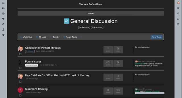
I use the dark "Cyborg" color scheme.
Comparing the "old" and "new" user interface on an iPhone 13 Pro:
The new interface shows less information (e.g., fewer topics per screen, no view count or reply count information). But probably not a bad thing for aging eyes (and we are all aging).
Also, the "quick reply" box at the bottom is unusable because the page control blocks the "Quick Reply" button -- you cannot tap that button.
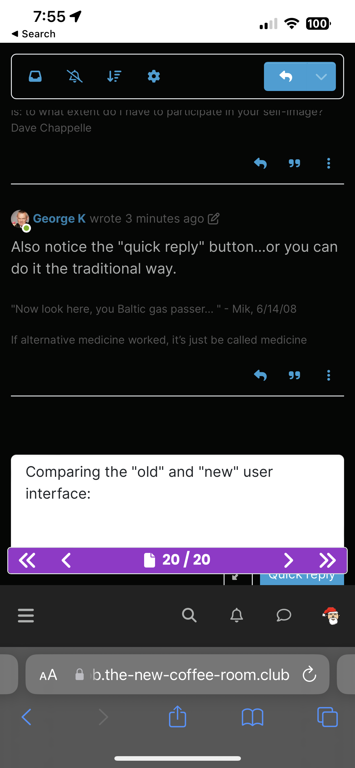
Not saying we need to revert to the old version, not leaving a historical record of how things used to be.
Carry on!
-
I use the dark "Cyborg" color scheme.
Comparing the "old" and "new" user interface on an iPhone 13 Pro:
The new interface shows less information (e.g., fewer topics per screen, no view count or reply count information). But probably not a bad thing for aging eyes (and we are all aging).
Also, the "quick reply" box at the bottom is unusable because the page control blocks the "Quick Reply" button -- you cannot tap that button.
Not saying we need to revert to the old version, not leaving a historical record of how things used to be.
Carry on!
-
It all seems fine to me. I have to remember to use the icons at the side of the screen, but I'll get the hang of that eventually. I think the overall look is an improvement, kind of in line with what I'm seeing at work with Outlook and what-have-you.
-
And you have to refresh/reload your browser window/tab to get the new interface ...
I have two Safari window/tabs opened to TNCR, one showing the old interface (and as far as I can tell, the controls still work and I can navigate with them just fine), one showing the new interface. You get the new interface after you refresh or reload your browser.
I will try to not reload/refresh my old TNCR window just to see how long I can keep using that old interface.

-
The mobile version’s search function is MUCH improved.
-
Quoted text is in a larger font - that's a good thing.
Toolbars are on the right and left of the main screen. Not sure about that.
-
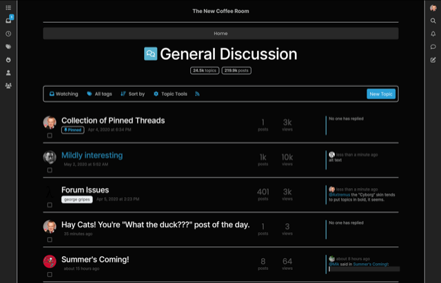
OK, so it turns out our old theme is still available in the new NodeBB version. It's just no longer the "default" theme.
I assume you guys like this version better?
-
OK, so it turns out our old theme is still available in the new NodeBB version. It's just no longer the "default" theme.
I assume you guys like this version better?

Hello! It looks like you're interested in this conversation, but you don't have an account yet.
Getting fed up of having to scroll through the same posts each visit? When you register for an account, you'll always come back to exactly where you were before, and choose to be notified of new replies (either via email, or push notification). You'll also be able to save bookmarks and upvote posts to show your appreciation to other community members.
With your input, this post could be even better 💗
Register Login