Now that’s an amazing map
-
@89th said in Now that’s an amazing map:
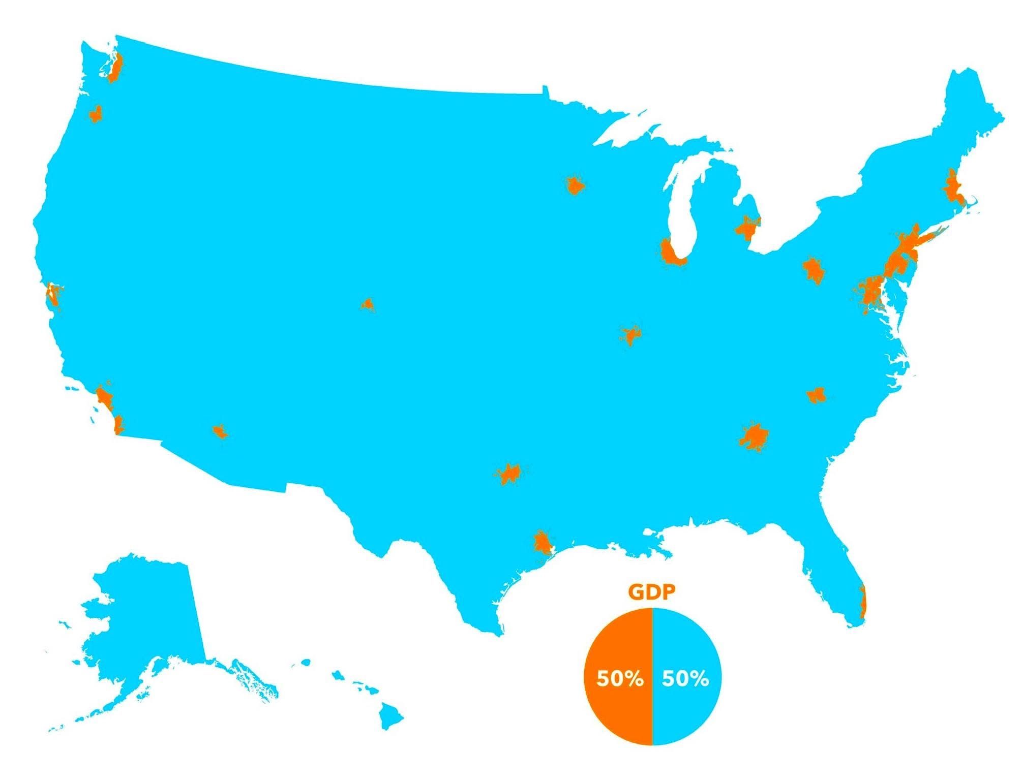
That's also a map of which areas (orange) would starve first if the blue area stops farming!
First thought I had...
“Cry havoc and let slip the DOGE of war!”
Those who cheered as J-6 American prisoners were locked in solitary for 18 months without trial, now suddenly fight tooth and nail for foreign terrorists’ "due process". — Buck Sexton
-
@89th said in Now that’s an amazing map:
That's also a map of which areas (orange) would starve first if the blue area stops farming!
First thought I had...
@Jolly said in Now that’s an amazing map:
@89th said in Now that’s an amazing map:
That's also a map of which areas (orange) would starve first if the blue area stops farming!
First thought I had...
First thought I had was that you were going to make that point.
Lo, no accord shall bloom 'twixt us and that realm, save they do kneel in token of their utter, soul-deep shame! No parley shall we hold, no treaty sign, until their will is broken, and their strength doth lie as dust before our might. -DJT, 3/6/26
-
@Jolly said in Now that’s an amazing map:
@89th said in Now that’s an amazing map:
That's also a map of which areas (orange) would starve first if the blue area stops farming!
First thought I had...
First thought I had was that you were going to make that point.
@jon-nyc said in Now that’s an amazing map:
@Jolly said in Now that’s an amazing map:
@89th said in Now that’s an amazing map:
That's also a map of which areas (orange) would starve first if the blue area stops farming!
First thought I had...
First thought I had was that you were going to make that point.
Ring it, mine the periphery, try to cut off the inbound ships and let the rats eat each other.
Should only take a few weeks.
-
I guess the percentage of the population living in those areas, while less than 50%, is also a quite significant fraction of the total population.
@Klaus said in Now that’s an amazing map:
I guess the percentage of the population living in those areas, while less than 50%, is also a quite significant fraction of the total population.
Yes. That’s why color coded county level maps showing voting patterns are so misleading.
-
I saw a similar map (which I cannot find now. aargh) which compared the GDP of Silicon Valley to the fifty states (did not include our 51st state - Canada. LOL).
Anyway, the GDP of Silicon Valley was higher than the GPD of at least 35 states.
But, as was pointed out by folks like @89th and @Jolly, it is a "symbiosis" relationship. One would not survive with out the other.
Hello! It looks like you're interested in this conversation, but you don't have an account yet.
Getting fed up of having to scroll through the same posts each visit? When you register for an account, you'll always come back to exactly where you were before, and choose to be notified of new replies (either via email, or push notification). You'll also be able to save bookmarks and upvote posts to show your appreciation to other community members.
With your input, this post could be even better 💗
Register Login