"Constant Swirling Storms"
-
-
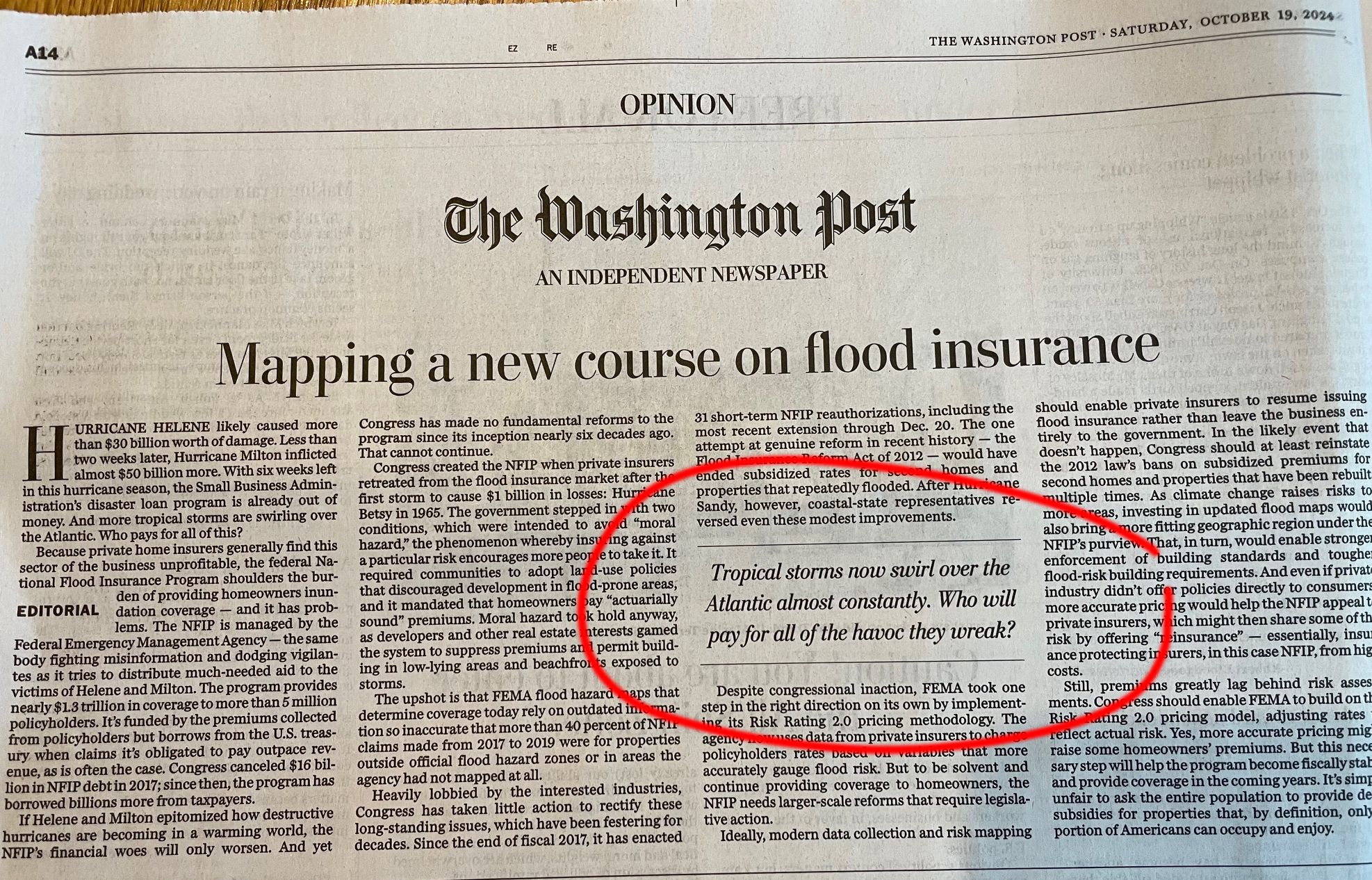
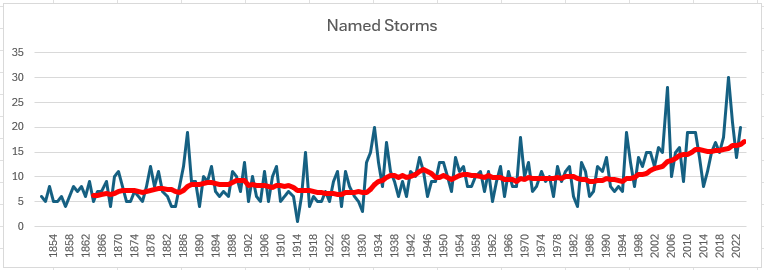
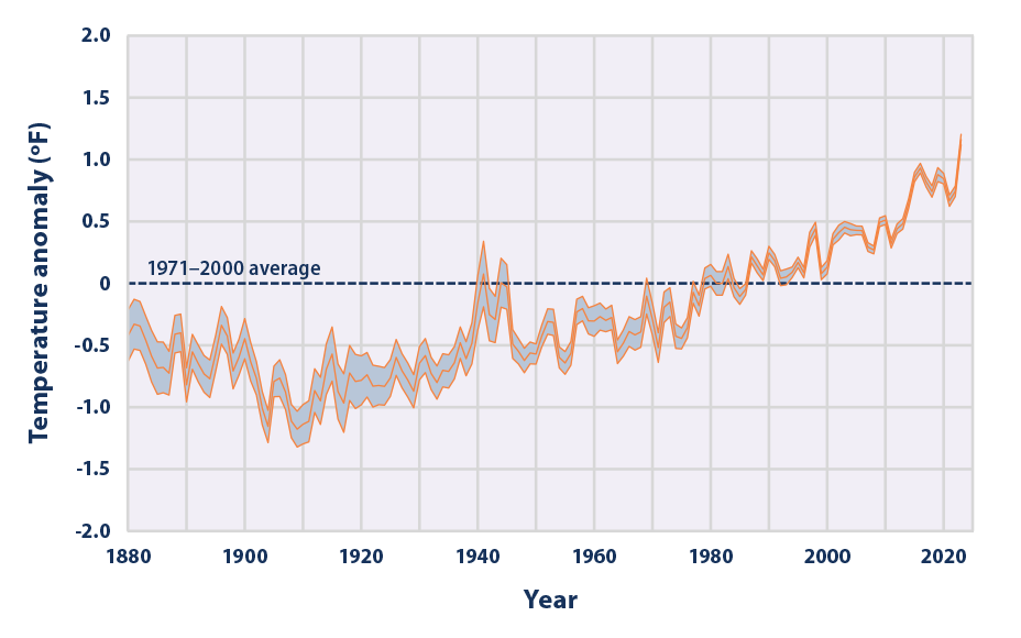
From @George-K 's data link. Red line is a 15-year moving average. The next chart is average sea temperature. Anyway... conclude what you will. I think there is some correlation, but not as much as some folks want you to believe. Note the above is in the "opinion" section.
Hello! It looks like you're interested in this conversation, but you don't have an account yet.
Getting fed up of having to scroll through the same posts each visit? When you register for an account, you'll always come back to exactly where you were before, and choose to be notified of new replies (either via email, or push notification). You'll also be able to save bookmarks and upvote posts to show your appreciation to other community members.
With your input, this post could be even better 💗
Register Login