Hay, Excel Masters!
-
I want to make a line chart that combines two sets of data.
I can't for the life of me figure out how to add the second data set to the graph from the first data set.
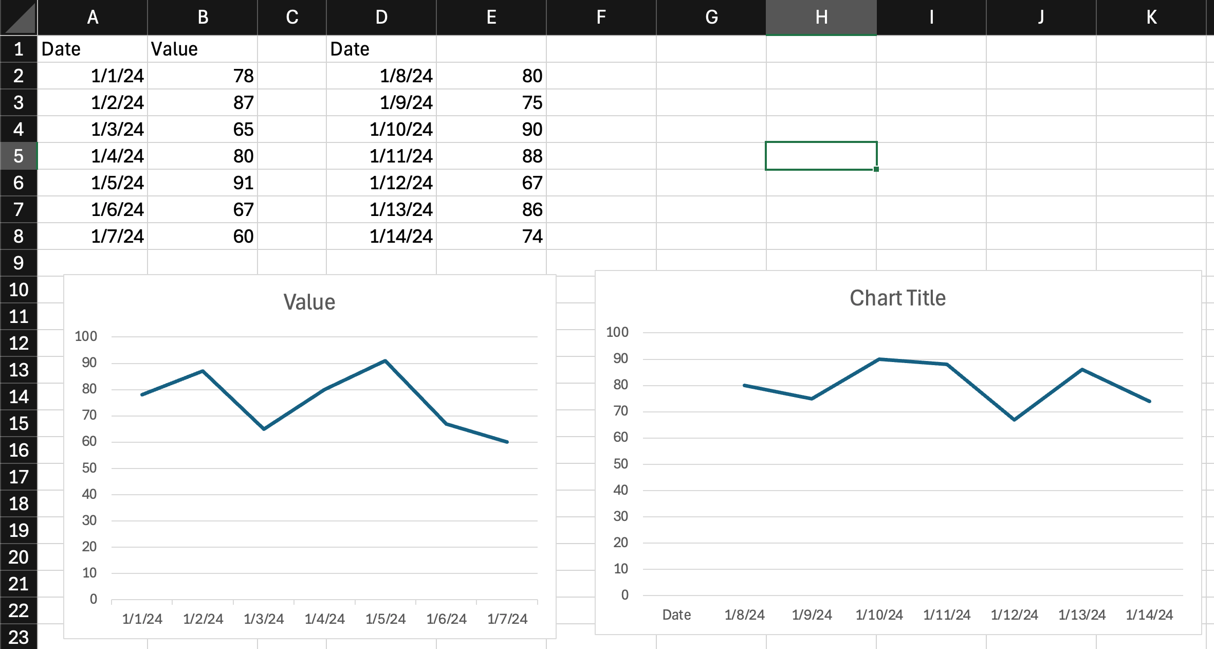
IOW - I want the chart to reflect data from 1/1/24 to 1/11/24,
If you're set on a "line chart," you can just copy the data in columns D:E to underneath the data already in columns A:B, then re-adjust the data ranges for your chart. Are you sure you want a "line chart"? Line charts in Excel use uniform spacing on the x-axis. You'll lose the relative spacing of your x-axis points.
I think you're better off using an X/Y plot instead. What I'd do is:
- Use chart type "X Y (Scatter)" instead of "Line"
- Create your XY plot with the first set of data
- Right click on the plot and "Select Data" and ADD the second data series
-
I have a feeling I missed something here.......... 555
-
@George-K get it figured out? It depends if you want the 2nd set of data to be in the same line as the first, or if you want two lines.
-
I would just copy the last pair of columns at the bottom of the first pair of columns. But I guess the problem isn't as simple as the example you provided.
@Horace said in Hay, Excel Masters!:
I would just copy the last pair of columns at the bottom of the first pair of columns. But I guess the problem isn't as simple as the example you provided.
That's the obvious, simple, solution. However, the actual sheet I'm working on has data that I want to keep visible below the first two columns. Hence the need for the 2nd column.
-
@89th said in Hay, Excel Masters!:
It would help to know what these values represent. Views of TNCR? Trips to the liquor store?
Dates and dollars
"Now look here, you Baltic gas passer... " - Mik, 6/14/08
The saying, "Lite is just one damn thing after another," is a gross understatement. The damn things overlap.
-
1 Prepare Your Data: Make sure your data is organized in columns. For example, let's say you have the following data: yamlCopy code A B C
2 1 Date Sales Expenses
3 2 01/01/2023 1000 500
4 3 02/01/2023 1500 700
5 4 03/01/2023 1300 600
6 5 04/01/2023 1700 800
7
8 Select the First Data Series:
◦ Click and drag to select the first column of data, including the headers (e.g., A1:A5 and B1:B5).
9 Create the Initial Line Chart:
◦ Go to the Insert tab on the Ribbon.
◦ Click on the Line Chart icon in the Charts group, and select the desired line chart type (e.g., "Line" or "Line with Markers").
◦ Excel will create a line chart based on your selected data.
10 Add the Second Data Series:
◦ Right-click on the chart and select Select Data.
◦ In the Select Data Source dialog box, click the Add button to add a new series.
◦ In the Edit Series dialog box:
 Series name: Select the header of the second data column (e.g., C1).
Series values: Select the data range for the second column (e.g., C2:C5).
11 Edit Horizontal Axis Labels (if needed):
◦ In the Select Data Source dialog box, you might need to edit the horizontal axis labels if they are not correct.
◦ Click the Edit button under Horizontal (Category) Axis Labels.
◦ Select the range for your date labels (e.g., A2:A5).
12 Format the Chart:
◦ You can format the chart as needed by right-clicking on different elements of the chart and choosing the appropriate formatting options.
◦ You can change the chart title, axis titles, legend, and other formatting options to make your chart more readable and presentable.
Example Walkthrough:
Given the following data in your Excel sheet:A
B
C
1
Date
Sales
Expenses
2
01/01/2023
1000
500
3
02/01/2023
1500
700
4
03/01/2023
1300
600
5
04/01/2023
1700
800
1 Select Data for Sales: Highlight cells A1:A5 and B1:B5.
2 Insert Line Chart:
◦ Go to Insert > Line Chart and choose the type of line chart.
3 Add Data for Expenses:
◦ Right-click on the chart and select Select Data.
◦ Click Add.
◦ In the Edit Series dialog:
Series name: Select cell C1.
Series values: Select cells C2:C5.
4 Edit Axis Labels (if necessary):
◦ In the Select Data Source dialog, under Horizontal (Category) Axis Labels, click Edit.
◦ Select the range A2:A5.
Now you should have a line chart that shows both Sales and Expenses over time. -
@89th said in Hay, Excel Masters!:
It would help to know what these values represent. Views of TNCR? Trips to the liquor store?
Dates and dollars
-
-
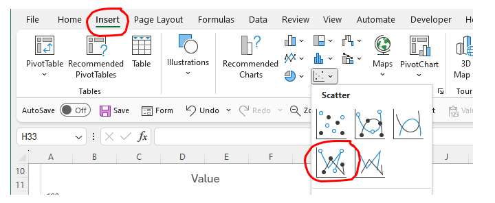
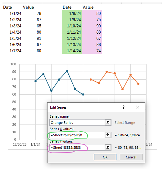
Ok, here are the steps I'd take. More details this time.
Steps:
- Select data in Columns A:B as shown.
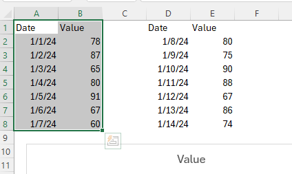
- In the Excel "Insert" ribbon, select chart type "X-Y Scatter". This will create an (X,Y) plot with the first data series as shown below.
-
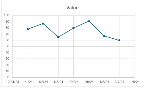
You should now have a plot that looks something like this:
-
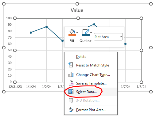
RIGHT-click on the chart -> Select Data.
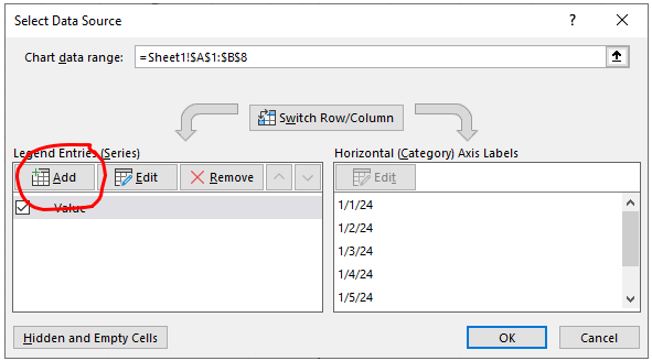
- Select Add
-
Select X data (green shaded) for Series X Values, and Y data (pink shaded) for Series Y Values.
-
You can format the lines to be the same if you want.
The only thing I don't know how to address with this method is that the two series will not be connected (end of the first series joined to start of second series). Not sure if that's a problem for you or not.
Good luck.
Hello! It looks like you're interested in this conversation, but you don't have an account yet.
Getting fed up of having to scroll through the same posts each visit? When you register for an account, you'll always come back to exactly where you were before, and choose to be notified of new replies (either via email, or push notification). You'll also be able to save bookmarks and upvote posts to show your appreciation to other community members.
With your input, this post could be even better 💗
Register Login