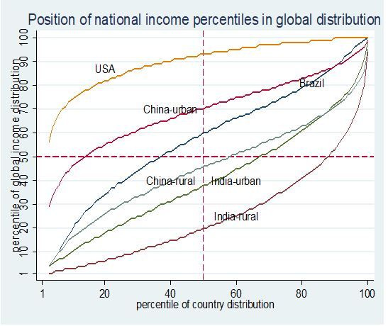
An interesting look at national vs global income distribution
-
So the graph maps your position in the National income distribution to your resultant position in the global distribution.
So if you’re at the 20th %ile of income in urban China, you’re around the 55th percentile in global income distribution, whereas a similar position within the US would put you at 80% globally.
Data from 2018.
-
Yup, people in the US do not really appreciate what they have.
-
Yup, people in the US do not really appreciate what they have.
@taiwan_girl said in An interesting look at national vs global income distribution:
Yup, people in the US do not really appreciate what they have.
Absolutely true
-
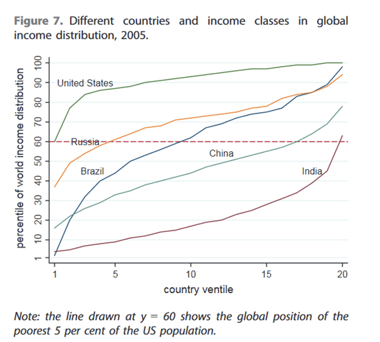
The “urban” curves for China and India in 2018 don’t look all that far apart from the China/India curves in 2005. It’s like only the urban cities improved their incomes for these two very large nations.
The USA curve may look less over-achieving if we also throw in the curves for Japan, Western Europe, and/or Australia.
Don’t even want to think about what the curves would look like for the oil exporters not engulfed in wars, like Saudi Arabia, Qatar, the UEA, Kuwait, or Brunei.
Hello! It looks like you're interested in this conversation, but you don't have an account yet.
Getting fed up of having to scroll through the same posts each visit? When you register for an account, you'll always come back to exactly where you were before, and choose to be notified of new replies (either via email, or push notification). You'll also be able to save bookmarks and upvote posts to show your appreciation to other community members.
With your input, this post could be even better 💗
Register Login