Forum Issues
-
@mark said in Forum Issues:
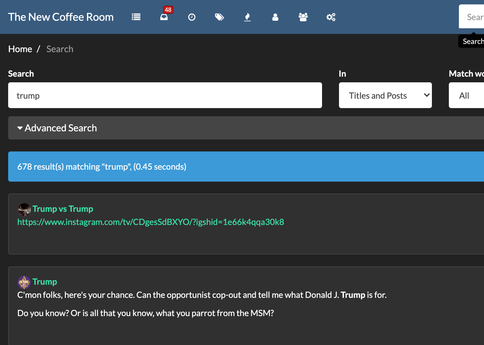
Darkly mode (any dark background theme actually) has a fucked up search result font color. Can't even see it.
Mark, I'd be glad to help.
What are you looking for? -
Hm, I tried "Darkly" and the fonts loook OK.

Maybe an issue with the particular browser you are using?
@klaus Nothing to do with the browser. Happens with any browser on Mac or PC.
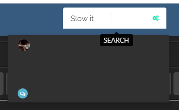
Your screenshot is not what i'm talking about. That's why I included a screen shot.
Click the magnifying glass icon in the upper right section of the page.
As you type, the "look ahead search" produces a list of results. The look ahead search result list font color is what i'm talking about.
-
Bad UX form to use ultra thin fonts in header material.
Just sayin', because I'm a dick and Klaus knows this. But he could use Comic Sans and it'd be okay. Thanks for all you're doing, it's crazy how many features you were able to add while keeping it bot-free.
-
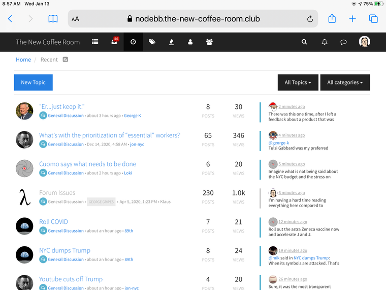
I’m having a hard time reading everything here compared to yesterday, has something changed? Everything seems smaller. (On my iPad - maybe it’s just me, and I need to put on my other glasses. But it looks different. )
@jodi said in Forum Issues:
I’m having a hard time reading everything here compared to yesterday, has something changed? Everything seems smaller. (On my iPad - maybe it’s just me, and I need to put on my other glasses. But it looks different. )
Jodi,
Post a screen shot. That might be my fault. I inadvertently clicked on the darkly skin in admin control and forgot to look at what it was set at before I did that. So I just picked the first one on the admin screen.
Klaus, does selecting a skin on the admin panel set the default skin? I was not aware of that. I thought I could inspect and or modify the attributes of the skin. My bad.
-
Yes, a new font is used on the General Discussion
directory page, it is less bold (skinnier lines) and darker color that blends with the background - needs more contrast between letters and the background and bolder fontIt is hard too tell the difference between read and unread threads because the colors are similar and dark
-
@jodi said in Forum Issues:
I’m having a hard time reading everything here compared to yesterday, has something changed? Everything seems smaller. (On my iPad - maybe it’s just me, and I need to put on my other glasses. But it looks different. )
Jodi,
Post a screen shot. That might be my fault. I inadvertently clicked on the darkly skin in admin control and forgot to look at what it was set at before I did that. So I just picked the first one on the admin screen.
Klaus, does selecting a skin on the admin panel set the default skin? I was not aware of that. I thought I could inspect and or modify the attributes of the skin. My bad.
@mark said in Forum Issues:
Klaus, does selecting a skin on the admin panel set the default skin? I was not aware of that. I thought I could inspect and or modify the attributes of the skin. My bad.
I don't know, but I also noticed that the forum looks different now. Maybe you can revert what you did?
-
Very sophisticated. I like it.
-
Very sophisticated. I like it.
@doctor-phibes I like this font, but it’s harder to read - skinnier and thinner. Especially on the table of contents page (ok, that’s not the right set of words, can’t think of what it’s actually called
 ) - the light grey (read) and the light blue (not read) are really pale.
-
I set it back to the "Readable" skin. Which I think is where it was before I
screwed things upmodifed the default.You can modify your personal settings to change it to anything you like.
-
-
Is there a way to insert a bulleted list?
I see the little icon to the right of the Italics, but when I select text, it only puts a bullet by the first item. Inserting a CR after each item doesn't seem to matter.
First Item
Second Item
Third Item=-=-=-=-=
- First Item
Second Item
Third Item
=-=-=-=-=
- First Item
Second Item
Third Item
- First Item

