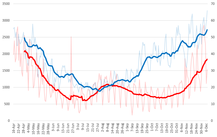
COVID vs TEMP
-
This is the least scientific thing ever, but...
Just now I wanted to chart the average USA temperature (BLUE) against the number of new COVID deaths (RED) for each day starting mid-April.
For the temperature, I inversed (e.g., 100-temp) it so in the chart the higher the blue line, the colder it is outside.
14-day moving average trendlines are displayed.
-
-
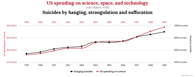
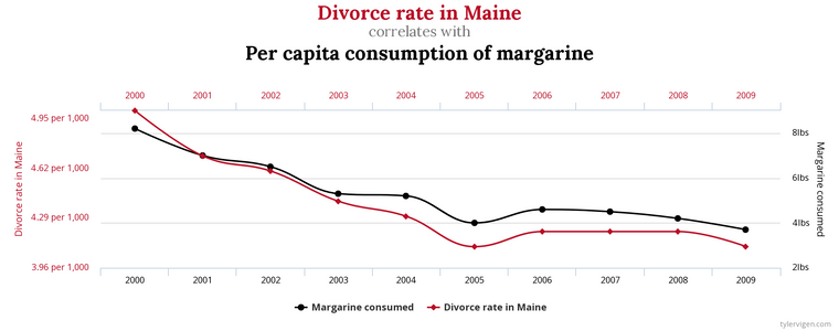
don’t know about the suicide graph but it’s common knowledge that using less margarine leads to happier marriages. At least that’s the way it is in our house.
-
@klaus 555
Hello! It looks like you're interested in this conversation, but you don't have an account yet.
Getting fed up of having to scroll through the same posts each visit? When you register for an account, you'll always come back to exactly where you were before, and choose to be notified of new replies (either via email, or push notification). You'll also be able to save bookmarks and upvote posts to show your appreciation to other community members.
With your input, this post could be even better 💗
Register Login