Skip to content
  • Categories
  • Recent
  • Tags
  • Popular
  • Users
  • Groups
Skins
  • Light
  • Cerulean
  • Cosmo
  • Flatly
  • Journal
  • Litera
  • Lumen
  • Lux
  • Materia
  • Minty
  • Morph
  • Pulse
  • Sandstone
  • Simplex
  • Sketchy
  • Spacelab
  • United
  • Yeti
  • Zephyr
  • Dark
  • Cyborg
  • Darkly
  • Quartz
  • Slate
  • Solar
  • Superhero
  • Vapor

  • Default (No Skin)
  • No Skin
Collapse

The New Coffee Room

P

Pablo

@Pablo
About
Posts
10
Topics
0
Shares
0
Groups
0
Followers
0
Following
0

Posts

Recent

  • Canadian Tariff situation gets its own thread
    P Pablo

    @Renauda said in Canadian Tariff situation gets its own thread:

    @Pablum

    And you can fuck off too, you little Trumpsucking republocrat troll.

    I actually love Canada. My comment was really directed at one stick-up-his-ass loudmouth, low-class Canadian, and he was actually clever enough to figure it out right away.

    It's gonna be really fun to watch you and the rest of the usual gang eat shit for the next 12 years. Enjoy!

    General Discussion

  • Canadian Tariff situation gets its own thread
    P Pablo

    Link to video

    Low class citizens from another shithole nation booing American National Anthem.

    General Discussion

  • 8 years ago about now
    P Pablo

    Congratulations, Jon. Glad you're still here. I wish you a long, healthy, prosperous life.

    Only reason I said anything the other day is because an otherwise intelligent, politically astute man should know better than to giggle in delight at the near assassination of a former president and wish him dead via heart attack.

    Let’s move on from that.

    General Discussion

  • Trump - Butler, PA
    P Pablo

    @jon-nyc said in Trump - Butler, PA:

    And the big fat pussy still left the stage. The ghost of TR is wondering where the men are these days.

    Again, not a good look. This says more about you than anything else.

    General Discussion

  • Foul reactions - Assassination Attempt
    P Pablo

    @jon-nyc said in Foul reactions - Assassination Attempt:

    True, given the backlash.

    But a nice heart attack would be another story

    This is not a good look for you.

    General Discussion

  • Trump - Butler, PA
    P Pablo

    @Jolly said in Trump - Butler, PA:

    @jon-nyc said in Trump - Butler, PA:

    Did he mention Jack Smith, Fani Eillis, or Alan Bragg?

    Jon, fuck you.

    +1

    General Discussion

  • Hay, Excel Masters!
    P Pablo

    Touché, Horace. You are a gifted teacher and a fine social commentator/educator/influencer. The world is lucky that you're willing to share your wisdom with us. 😃

    George, glad that you were able to get it to work.:male-doctor:

    Pablo

    General Discussion

  • Hay, Excel Masters!
    P Pablo

    Ok, here are the steps I'd take. More details this time.

    Steps:

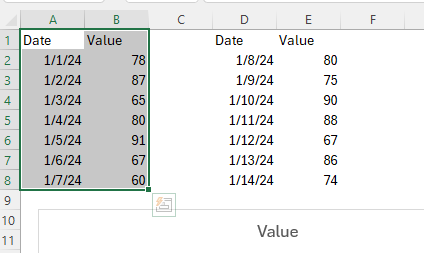
    1. Select data in Columns A:B as shown.

    2d386de6-3e3f-42ed-a226-0abbb9c4d63e-image.png

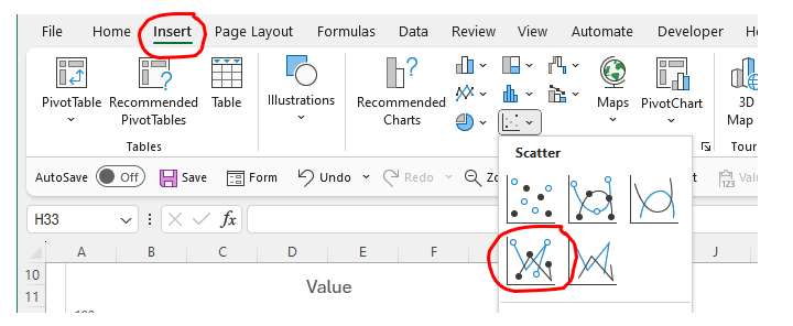
    1. In the Excel "Insert" ribbon, select chart type "X-Y Scatter". This will create an (X,Y) plot with the first data series as shown below.

    b3e7e088-3e5e-4d22-9fd3-eed3b5bc759b-image.png

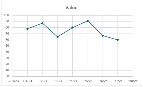
    1. You should now have a plot that looks something like this:
      afcb8336-3c93-49e2-b3c8-3bcd36ae6148-image.png

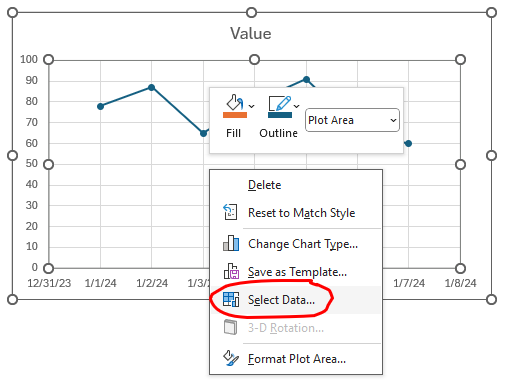
    2. RIGHT-click on the chart -> Select Data.

    fa75a8ed-a9bb-4745-ac85-5b1155b32b13-image.png

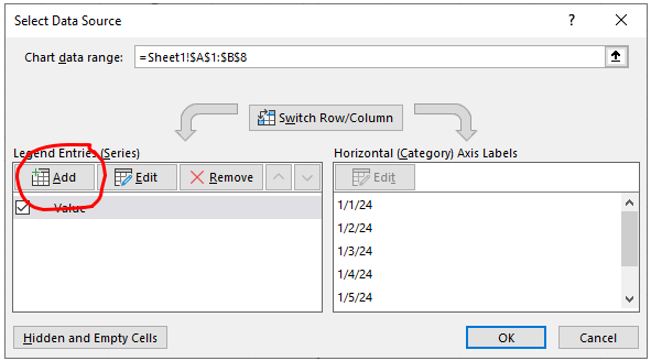
    1. Select Add

    b3ecae0f-88b2-4528-aae1-ebdaec9dad3a-image.png

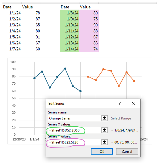
    1. Select X data (green shaded) for Series X Values, and Y data (pink shaded) for Series Y Values.
      352c87bb-1b8a-4682-9b31-d5f4b10136f7-image.png

    2. You can format the lines to be the same if you want.

    The only thing I don't know how to address with this method is that the two series will not be connected (end of the first series joined to start of second series). Not sure if that's a problem for you or not.

    Good luck.

    General Discussion

  • Hay, Excel Masters!
    P Pablo

    @George-K

    If you're set on a "line chart," you can just copy the data in columns D:E to underneath the data already in columns A:B, then re-adjust the data ranges for your chart. Are you sure you want a "line chart"? Line charts in Excel use uniform spacing on the x-axis. You'll lose the relative spacing of your x-axis points.

    I think you're better off using an X/Y plot instead. What I'd do is:

    1. Use chart type "X Y (Scatter)" instead of "Line"
    2. Create your XY plot with the first set of data
    3. Right click on the plot and "Select Data" and ADD the second data series
    General Discussion
  • Login

  • Don't have an account? Register

  • Login or register to search.
  • First post
    Last post
0
  • Categories
  • Recent
  • Tags
  • Popular
  • Users
  • Groups