Interesting map
-

-
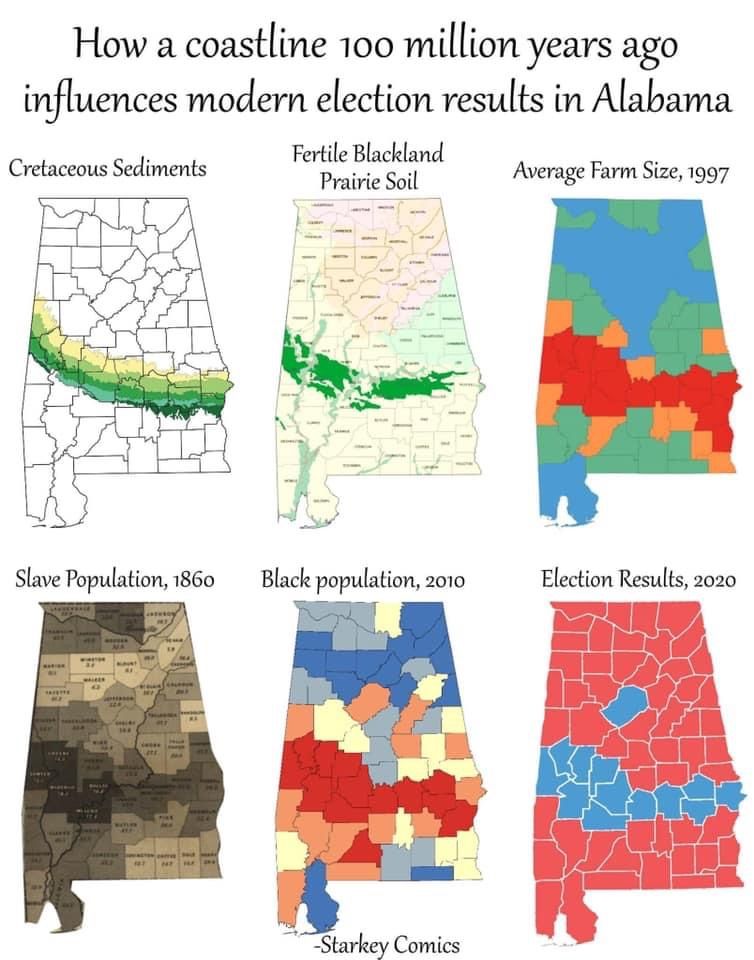
Interesting. I assume that the average farm size diagram, the red is smallest?
-
Interesting. I assume that the average farm size diagram, the red is smallest?
@taiwan_girl said in Interesting map:
Interesting. I assume that the average farm size diagram, the red is smallest?
The opposite, I think…
-
@jon-nyc plus, it’s more fertile land thanks to the sediment. The largest farms and plantations would be where the land was best…
Hello! It looks like you're interested in this conversation, but you don't have an account yet.
Getting fed up of having to scroll through the same posts each visit? When you register for an account, you'll always come back to exactly where you were before, and choose to be notified of new replies (either via email, or push notification). You'll also be able to save bookmarks and upvote posts to show your appreciation to other community members.
With your input, this post could be even better 💗
Register Login