Funny Pics
General Discussion
8.2k
Posts
33
Posters
2.4m
Views
2
Watching
-
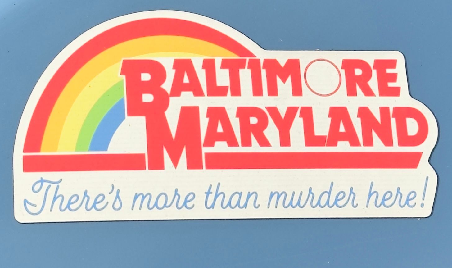
One for @George-K ("you get used to it"), @LuFins-Dad and a few others:
It takes some unpacking to appreciate how clever this is.
For one, the tagline construction is a snowclone of a lot of popular tourism taglines, some of which were popular in the 80s and 90s. I believe Indiana had one that was "there's more than corn in Indiana," and California's was "there's more than gold."
But the greatest freaking thing is the design. It's a knockoff of the Reading Rainbow logo.
Know why?
Because in the 80s and 90s, Baltimore's slogan was—I shit you not, they thought this up—"The City That Reads."
This is just brilliant.
-
-

