On American Healthcare
-
-
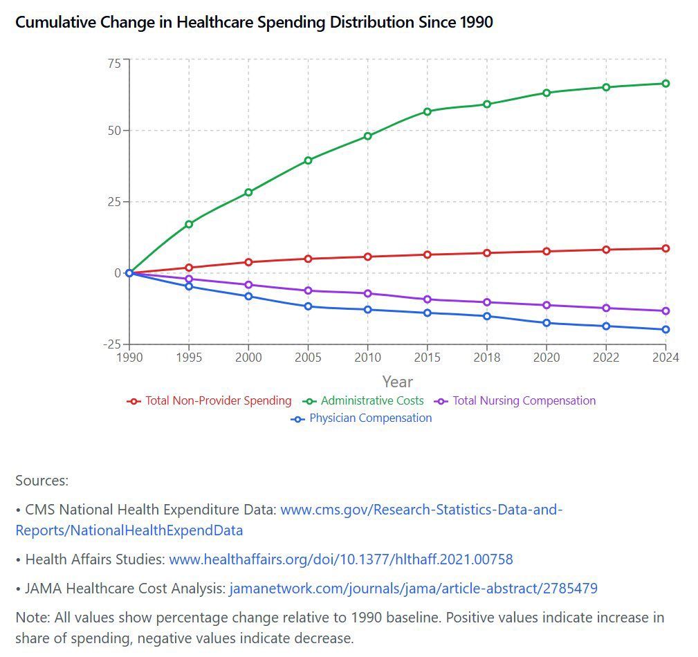
The graph would indicate that the horror years are between 1990 and 2015 rather than just those of Obamacare, although admittedly since the graph doesn't go back before 1990, where it is actually at its steepest, it's a little hard to draw a conclusion of exactly when the rot set in.
-
Also the denominator is much lower in administrative costs than for provider costs. This makes the graph misleading.
Like when you see cumulative percentage growth of religions and Christianity and Islam are relatively flat while wiccanism increased 100x.
Hello! It looks like you're interested in this conversation, but you don't have an account yet.
Getting fed up of having to scroll through the same posts each visit? When you register for an account, you'll always come back to exactly where you were before, and choose to be notified of new replies (either via email, or push notification). You'll also be able to save bookmarks and upvote posts to show your appreciation to other community members.
With your input, this post could be even better 💗
Register Login