What is this map?
-
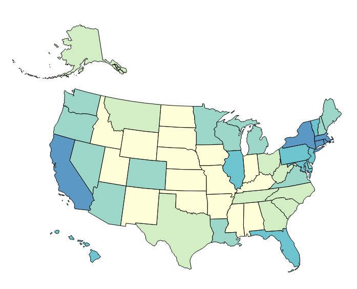
If you want to move to America, the colors indicate what area has the closest climate to where you came from. So Mexico is closest to the Indian climate. Southern California is closest to Portugal...
"Now look here, you Baltic gas passer... " - Mik, 6/14/08
The saying, "Lite is just one damn thing after another," is a gross understatement. The damn things overlap.
-
If you want to move to America, the colors indicate what area has the closest climate to where you came from. So Mexico is closest to the Indian climate. Southern California is closest to Portugal...
@George-K Ah, I was thinking weather also!!!
-
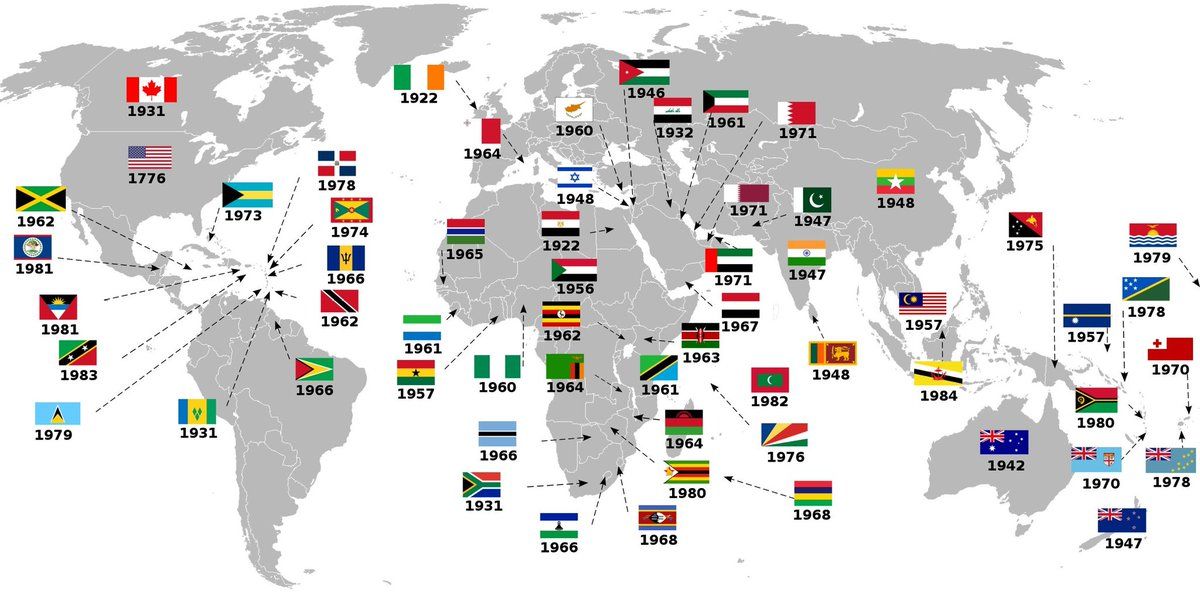
Based purely on the U.S. and Canada - I'd say that's when they legally left the mothership (UK).
-
I’d say ‘shithole country score’ but Russia wouldn’t be yellow.
-
@jon-nyc said in What is this map?:
I’d say ‘shithole country score’ but Russia wouldn’t be yellow.
Actually, you’re not too far from being correct!
-
@jon-nyc said in What is this map?:
I’d say ‘shithole country score’ but Russia wouldn’t be yellow.
Actually, you’re not too far from being correct!
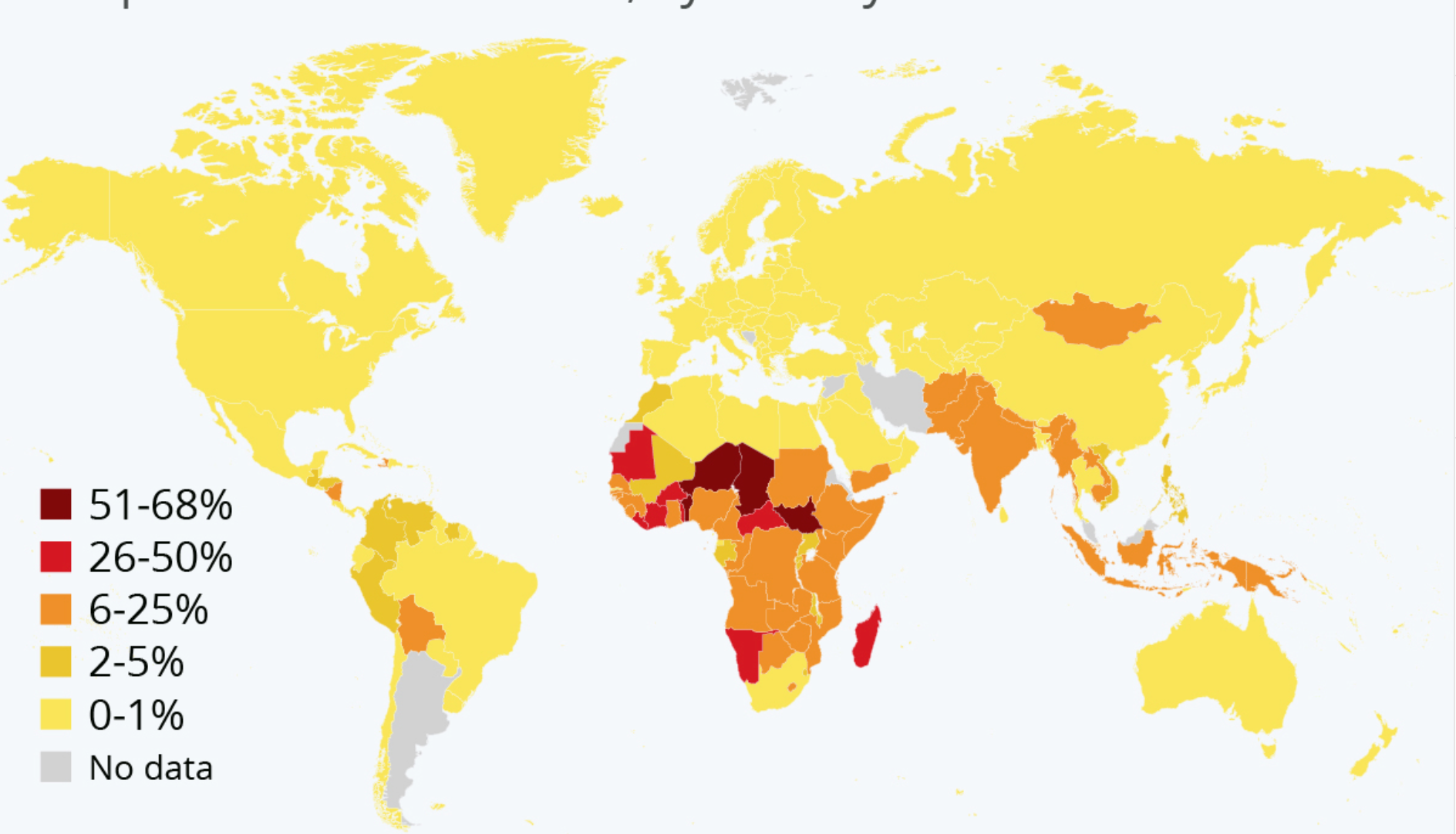
If it’s outhouses per capita, Russia should be not be in the same category as North America and Europe. Rather it should be red. I seem to recall a stat from a couple of weeks back that close 76 million Russians still lack running water and sanitation in their homes and rely on communal water pumps and outhouses.
Elbows up!
-
Maybe % of women that have 5 or more kids?
-
If it’s outhouses per capita, Russia should be not be in the same category as North America and Europe. Rather it should be red. I seem to recall a stat from a couple of weeks back that close 76 million Russians still lack running water and sanitation in their homes and rely on communal water pumps and outhouses.
@Renauda said in What is this map?:
If it’s outhouses per capita
Even closer!
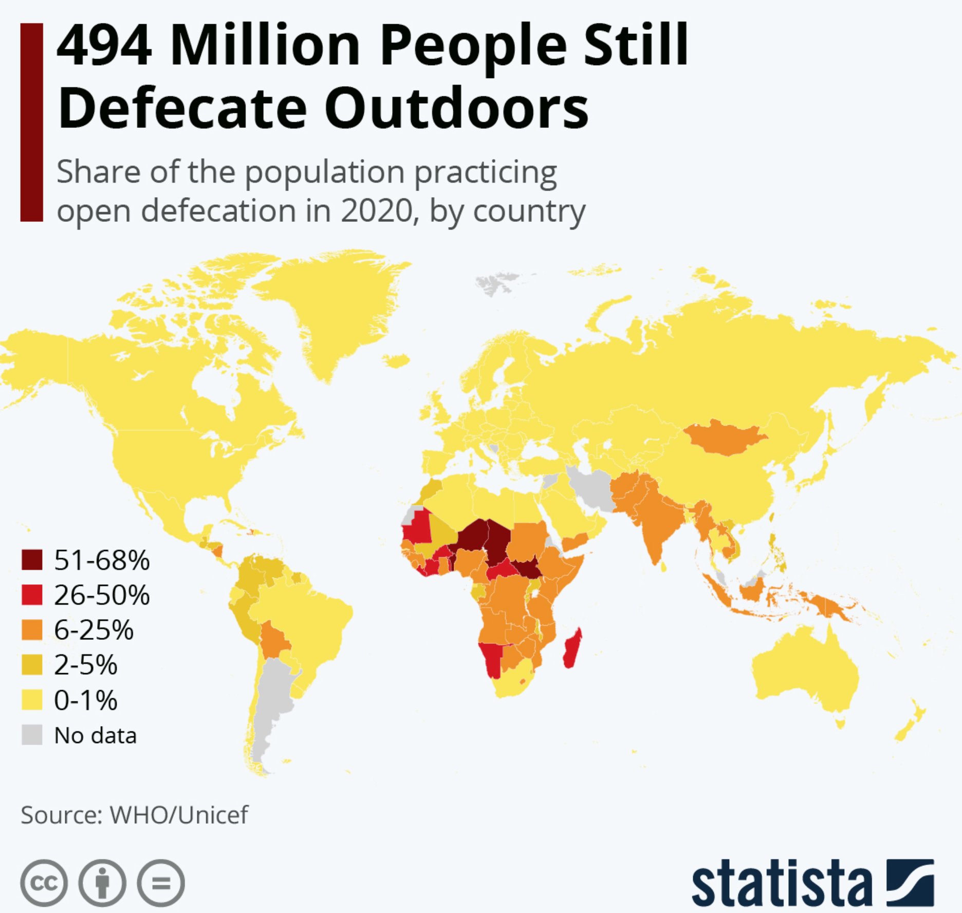
https://www.statista.com/chart/18419/progress-against-open-defecation/
-
I understand that shitting etiquette in Argentina is a state secret.
Hello! It looks like you're interested in this conversation, but you don't have an account yet.
Getting fed up of having to scroll through the same posts each visit? When you register for an account, you'll always come back to exactly where you were before, and choose to be notified of new replies (either via email, or push notification). You'll also be able to save bookmarks and upvote posts to show your appreciation to other community members.
With your input, this post could be even better 💗
Register Login